- Writings
Designing for Users When the Traffic Floods In
Under 1% of paid social visitors reached the leaderboard. 85% of LinkedIn visitors did, even on mobile. How I designed and built for the right users, solo, with a schema-driven design system.
Sep 19, 2026
During the first week after the ads went live, I spent a long time staring at the analytics dashboard.
The traffic kept going up. The numbers looked great.
Then I opened the source breakdown, and my heart sank a little.
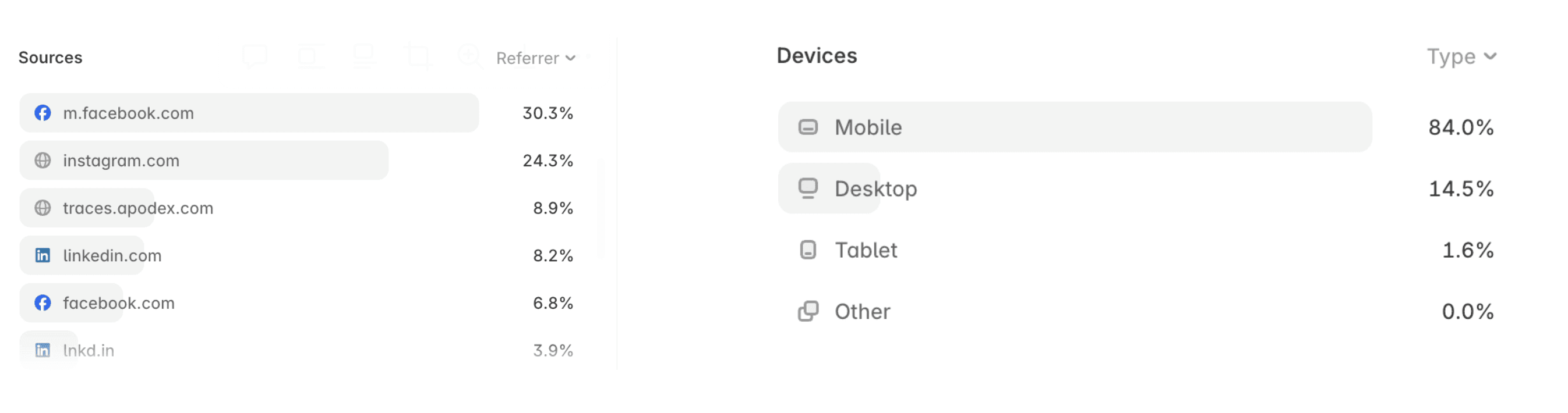
Most of the traffic was coming from Facebook and Instagram. Nearly 90% of visitors were on mobile, and on average, each person viewed just a little over one page before leaving. On one comparable site, that number is closer to four.
None of this was particularly surprising.
TRACES is a benchmark for evaluating AI on scientific discovery. There are probably only a few thousand scientists and research teams around the world who genuinely need something like this. Social advertising casts a very wide net. Most of what it catches is people scrolling on their phones who happened to tap on something interesting.
What made the situation harder was what I was asking from them.
I wanted someone to make sense of a fairly dense scientific leaderboard: 1,182 trajectories, 17 environments, and 11 solvers.
And after understanding all that, I wanted them to consider submitting a problem or a solver themselves — something that could easily take weeks of preparation.
On one side, I had the least targeted audience imaginable.
On the other, I was asking for one of the heaviest possible forms of engagement.
Not exactly an easy opening.
But the results surprised me, in both directions.
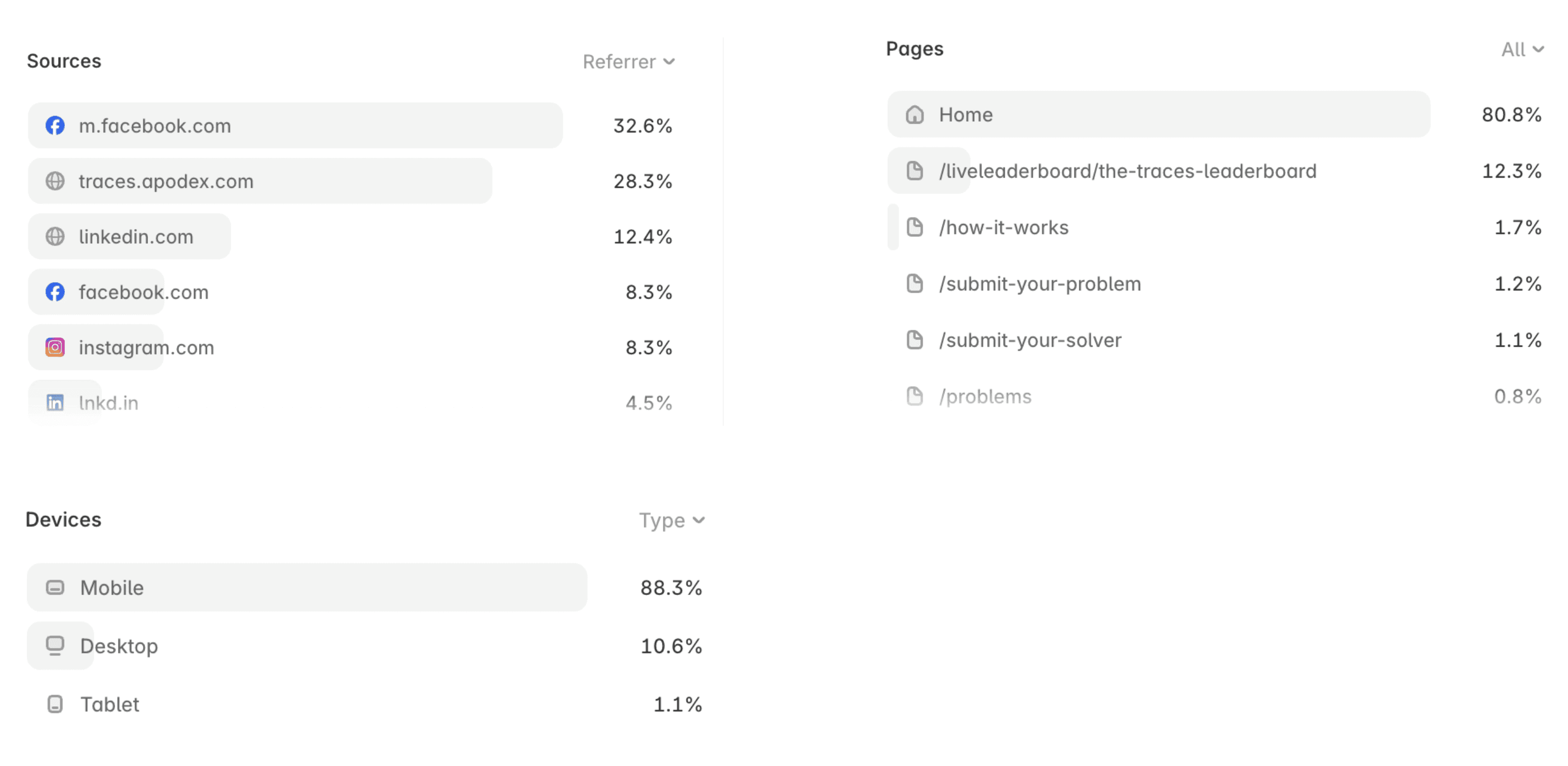
The Facebook and Instagram traffic was exactly as bad as it looked. Fewer than 1% of those visitors went from the homepage to the leaderboard. No amount of design was going to fix that. They were never looking for a benchmark in the first place.
LinkedIn was a different story. 85% of LinkedIn visitors went on to the leaderboard, more than 85 times the rate of social traffic.
And most of them were on their phones too. Among LinkedIn visitors on mobile, 85.9% made it to the leaderboard.
A dense scientific leaderboard is exactly the kind of page people assume you need a laptop to read. For the people who actually needed TRACES, the phone was where they read it.
Looking back, I don't think there was a single moment of inspiration that made this happen.
The things that mattered had mostly happened before the ads ever arrived.
The First 100 Users Set the Standard
Before spending a dollar on advertising, I followed the first 100 active users through Clarity.
I watched where they went first, where they paused, and where they got stuck. Then I tried to think one step ahead of them.
I started treating those first 100 users like VIPs.
Not because they were few, but because they were the people who actually needed the product.
They helped me answer a question that advertising can never answer:
When someone genuinely needs TRACES, what do they need to know first?
One thing became obvious very quickly.
Before people were willing to seriously read anything, they wanted to know whether this benchmark was actually alive.
So I started every leaderboard card with the simplest possible proof:
1,182 trajectories · 17 environments
No explanation. The numbers could speak for themselves.
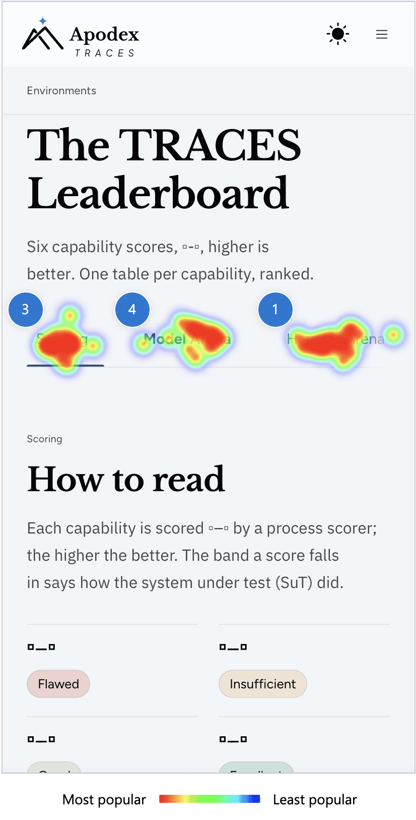 The numbers did their job. On mobile, readers went straight for the leaderboard tabs (left) and into the charts behind them (right). | 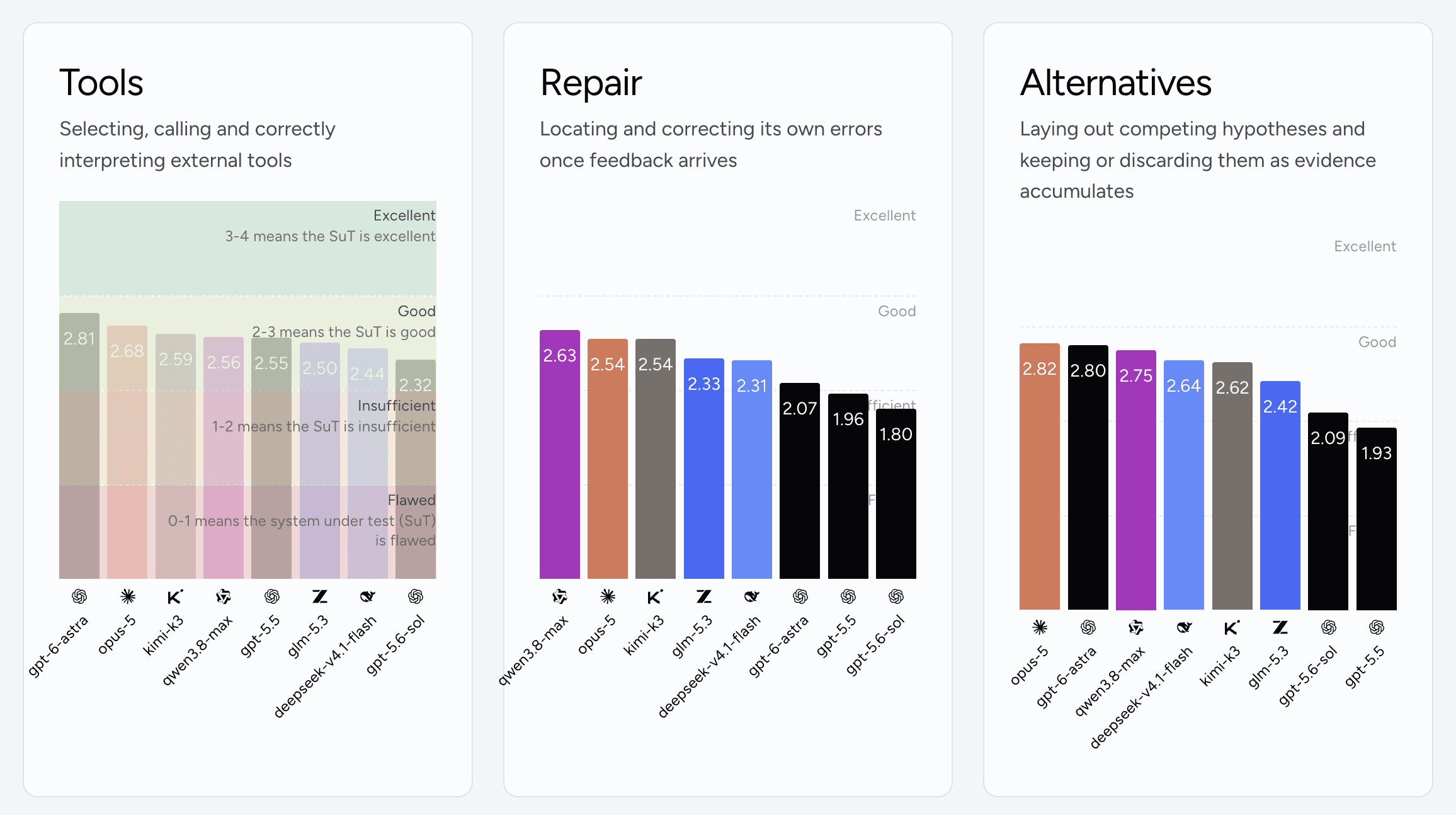 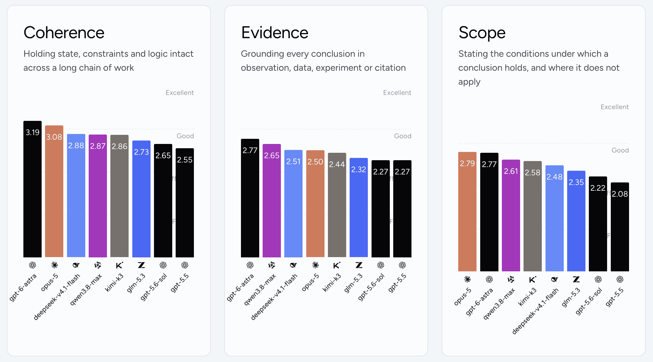 | |
|---|---|---|
The charts were redesigned for mobile around the same time.
A scientific table packed with metrics doesn't become easier to read on a small screen simply because you make the type smaller. The real work was deciding what absolutely needed to stay visible, and what could temporarily move into the background.
[Screenshot: the leaderboard on mobile]
So when the advertising traffic finally arrived, it wasn't arriving at a page designed for everyone.
It was arriving at a product whose standards had already been defined by the people who genuinely cared about it.
The standard had been set early.
And it was set by those first 100 users, not by the flood that came afterward.
Keeping the Product Moving
Once the campaign started, I was discovering something new almost every day.
A metric wasn't clear enough.
A question on the form was unnecessary.
The order of a table needed to change.
These things look small, but they are some of the most valuable forms of user feedback.
In many teams, even a small change has to travel through the entire design-development-release cycle. By the time the change is shipped, the traffic spike that exposed the problem may already be long gone.
This project was different.
I was the designer, but I was also building the frontend, connecting the data, and handling the backend.
That changed the speed of the feedback loop completely.
I couldn't keep up by simply working longer hours.
I could keep up because design and engineering were not separate steps in the process.
I also wasn't designing the leaderboard and submission forms as isolated pages.
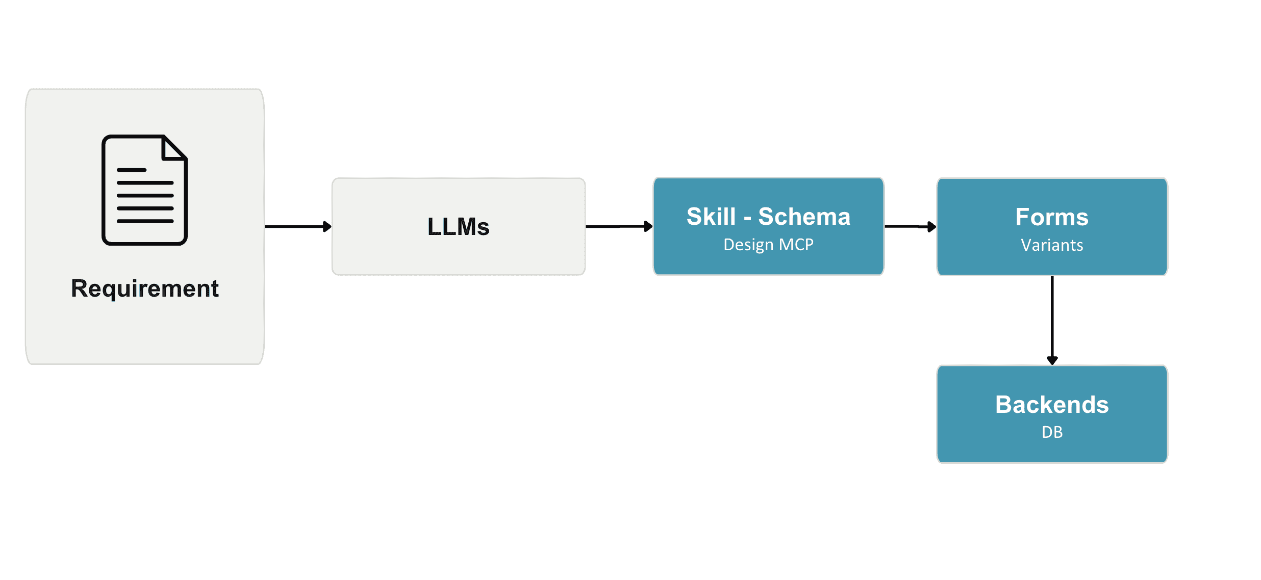
The underlying structure was defined as data and rules. The Io design system turns those rules into a structured schema that can be reused across the product. Combined with the skills and accumulated memory from previous work, I could redesign a form, adjust its behavior, and reconnect it to the real data flow without rebuilding the whole thing from scratch.
Smart-forms in Io Design system
The benchmark worked in much the same way.
Leaderboard-bars in Io Design system
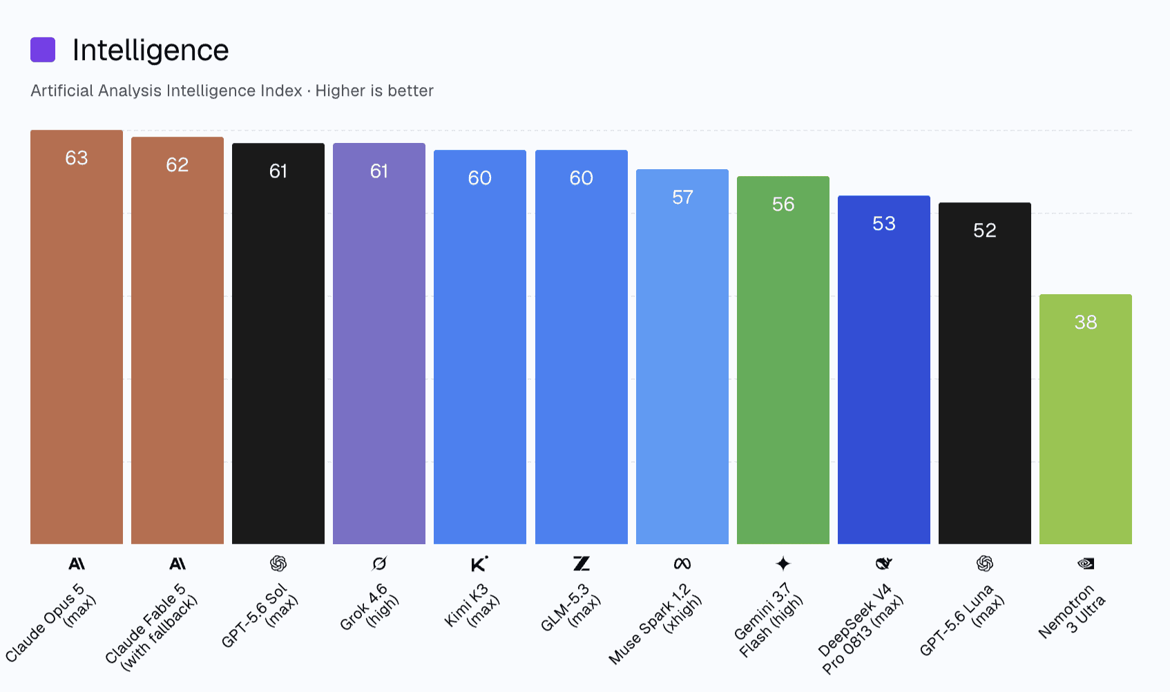
When the results were already structured as data, I didn't need to repeatedly rearrange layouts, compare datasets, normalize formats, and then place everything back into the interface.
I could move much closer to the actual result.
And that changes what a designer spends time doing.
I would rather decide whether a result makes sense than spend my time moving the result around.
That's also why I'm looking forward to feeding the benchmark skill more and more kinds of result formats. The more real data it encounters, the more useful it becomes.
The Design Loop Gets Smaller
There is something I've come to appreciate from working this way.
The advantage of owning both design and engineering isn't simply that things get built faster.
It's that the distance between seeing a problem and changing the product becomes much smaller.
A user gets stuck.
I see it in the data.
I change the interaction.
The change goes live.
I watch what happens next.
Then I change it again.
There is no handoff in the middle. No waiting for another team to translate an idea into something buildable. And no need to protect the original design from the reality of the product.
The reality is the design process.
For me, this is where design systems become much more interesting.
They aren't just a way to keep interfaces consistent.
They can become a way to preserve decisions, patterns, data structures, and lessons from previous iterations — so that the next change starts from what I've already learned instead of from a blank page.
The system gets better because the product gets used.
And the product gets better because the system remembers.
A Note at the End
I don't get to decide who advertising brings through the door.
What I can decide is how prepared the product is when they arrive.
Design can't turn the wrong audience into the right one. What it can do is make sure that when the right person does arrive, on whatever screen, nothing stands in their way.
This project made me rethink what "user-centered design" actually means. It doesn't mean designing for everyone who happens to show up. Sometimes it means finding the right users early enough that they can help you decide what deserves to stay. Then, when thousands of strangers suddenly arrive, the product still knows what it is.
Let the right users set the standard early.
Make it possible to change a page in tens of minutes instead of weeks.
Shorten the distance between feedback and action.
When all three live inside one system, I can spend my time where I think it belongs:
watching users, understanding what they need, and designing the next thing.
That's the first part of what I want to share: how do you keep designing for the users who matter when an ocean of advertising traffic suddenly arrives at your door?