- Writings
IO: a design system with a second reader
Designed and built solo at Shanda. A design system that people and models read from the same source, so a team with no front-end engineers can ship product.
Oct 24, 2026
Every design system I built before io had one kind of reader: a person. io has two. It is written so that a designer and an AI agent can open the same component, read the same rules, and build the same thing.
Role Designed and built it end to end: the components, the generated schemas, the theme layer, the memory service, the MCP access, and the review pipeline. React and TypeScript on the front end, Python on the back end.
Problem New business lines at Shanda arrived with no front-end or back-end engineers. AI was already generating screens. A system built for people to browse was not being broken. It was being skipped.
Outcome 70 components and 1,335 documented props, each addressable by URL and over MCP. Products shipped on it include Tanka's Japanese launch, TRACES, Apodex Lab, and EverOS, which I designed, coded, and shipped solo in three weeks against a previous two months for a full team. A CRM front end was built on it in two days.
Skipped, not violated
By early 2025, AI generation was already part of the workflow. The risk was never that it made bad UI. The risk was that it made passable UI fast enough that nobody opened the design system at all. What was really being tested was whether the system was still the fastest way to get a screen. For the first time in nineteen years of building these, it was not.
The reason was the reader. A component library is built for a person to browse. A person fills in what the file does not say. A model does not. It reads one frame, never learns there was a second one, and returns something that looks right and is wrong. On these business lines there was also no front-end engineer to catch it. Everything that used to live in that person's head had to go into the system itself.
So I set five rules.
Constrain the choice set. Only registered components and theme slots. A model cannot invent UI outside them.
Declare, don't depict. Every component carries a machine-readable description of what it is and what it may be.
Generate the declaration, never write it. Hand-written descriptions drift.
Persist the decisions. Memory is not a prompt.
Check while generating, not after. Review does not scale.

How io is put together.
Props, not variants
The hardest problems in component design are property sprawl and polymorphism: one component that has to be many things. The usual answer is variants, a fixed picture for every combination. Variants multiply, and a model can only copy the one it was shown.
io drives all 70 components through their properties instead. A component is one definition with typed values, and agent skills drive it through those values. Every combination is valid by construction, so a model composes from a constrained set rather than drawing something new.

Variants multiply. Props describe.
The catalogue
Seventy components in two layers: 31 UI basics every page is built from, and 39 enhancements for motion, media, and 3D. Every one has its own page with a live specimen, its full prop table, and the URL that inserts it. A person browses the page; a model reads the same page as structured text.
Data visualization. HighchartsX draws 48 chart types from one JSON payload, every colour taken from the theme tokens. A model picks the type and binds the columns; the component does the rest.

Twenty charts from three components: HighchartsX, LeaderboardBars, and ChartX2. Categorical, ranged, flow, hierarchy, and financial types, all from schema.
SolarIso. Isometric exploded drawings from a JSON payload of parts. A new illustration is a new schema rather than new artwork, which is how every essay on my site gets its own drawing.
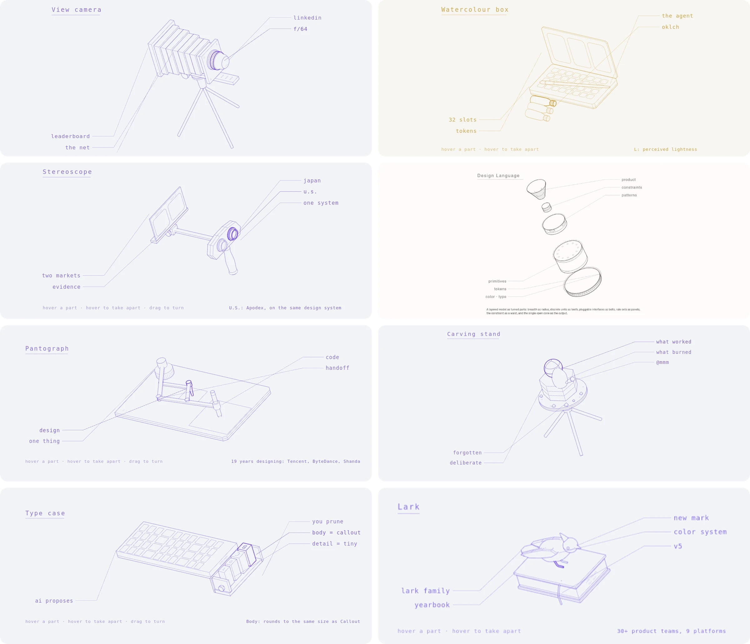
Eight SolarIso drawings. Each is a payload of parts with labels; hover a part to read its note, drag to turn.
UI basics. Thirty-one components every page is built from, all reading colour, type, and radius from the same tokens. One click on a swatch recolours every one of them.

Buttons, inputs, selection, overlays, and navigation from the UI Basics layer, with the 24-theme switcher underneath.
Design is code
There is no design file to keep in sync. The components are the design. Each one has its own page with a live specimen, the full prop table, and the URL that inserts it, and the whole catalogue is published as a machine-readable manifest. Each component's schema is generated from its source, so the guidance a model reads cannot drift from the code it calls.
Colour works the same way. A theme resolves from one input colour and every surface follows. Each text and surface pair is validated as the theme generates, against WCAG ratios and against lightness difference in OKLCH, which catches the dark mode cases WCAG's weighting misses. A failing pair cannot reach the page.
Memory and review
A system records values. It rarely records the rule behind them. io keeps decisions and the reasoning behind them in a memory service that agents read before they build, so a new screen starts from what the system already knows instead of from a blank prompt.
Code review runs as an eval rather than by eye. A review agent traces each component's structure and render flow, and every finding has to name the input that breaks it, cite the exact lines, and propose a drop-in fix. Any must-fix finding forces a changes-required verdict, and every review is kept as a record.
In practice: a CRM in two days
The clearest test was a CRM front end over more than 100,000 records, built with an agent in two days. The rule was strict: only components in the catalogue, tokens read-only. When the agent needed something the system could not do, such as a controlled value on a select or an authorization header on the virtual list, the fix went into the component, not into a workaround on the page. Four components got better. The page stayed clean.
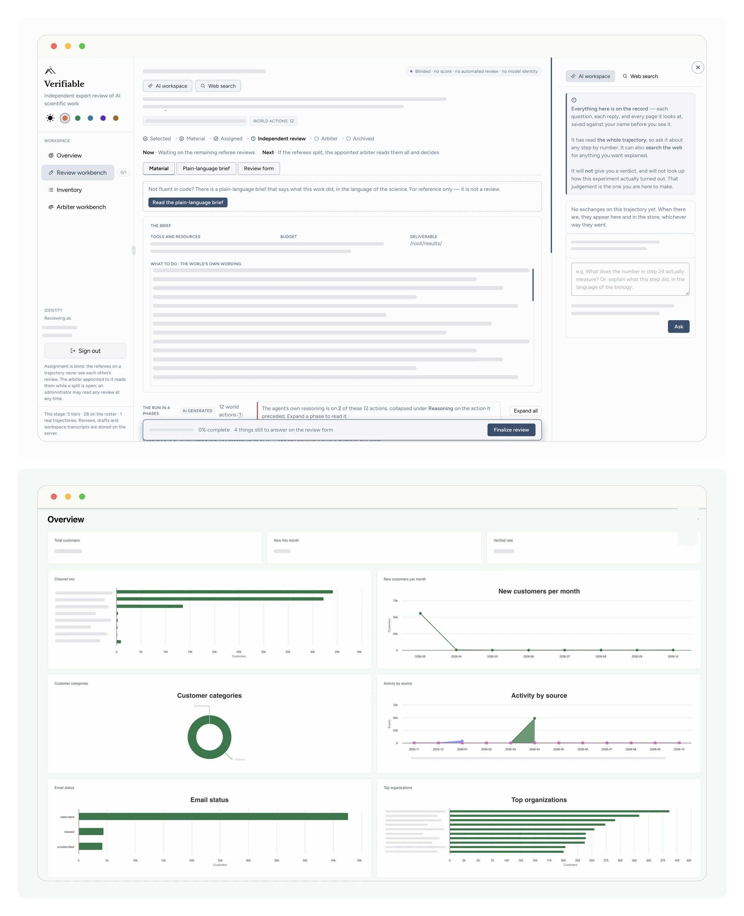
Internal tools on io: Verifiable, the expert review workbench behind TRACES, and the CRM dashboard. Customer and task data redacted.
The charts were the interesting part. The first version asked the model for whole charts, and everything came back as a bar chart. Instead of a bigger model, we changed the contract. The model now returns only a chart template and the column names to bind. The front end fills in the data and takes colour from the tokens.

The chart contract from the CRM build.
Built on io
The same system carried the rest. Every product gets its own face. None of them gets its own system.


Related reading
Sep 23, 2026
Io design system, Design MCP, Design Engineering
Design Notes on Japanese and English-Speaking Users
Apr 20, 2026
UX, Design Systems, Systems Thinking, AI Agent
AI Design System - Part 1 Color
May 10, 2026
Typography, AI Design Tools, Design Systems, UX, Product Design
AI Design System - Part 2 Typography for Taste
_ ___ __ ____ __ / | / (_)____/ /__/ __ \__ __ ____ ______/ /_ / |/ / / ___/ //_/ / / / / / // __ `/ ___/ __/ / /| / / /__/ ,< / /_/ / /_/ // /_/ / / / /_ /_/ |_/_/\___/_/|_/_____/\__,_(_)__,_/_/ \__/