- Writings
Lark Design, 2021 to 2023
VP of Design, ByteDance (Lark). The brand, principles, and design system behind Lark's move to v5 and international markets.
Oct 24, 2026
When I joined Lark in May 2021, I set the design team three goals. The first was the brand. This is the story of that brand, the principles we judged work by, and the system that carried both across more than thirty product teams.
Role Set Lark's design direction and led brand, UX, research, and the design system, aligned with product and executive leadership. Grew the team from 100 to 300+ designers across 11 teams.
Problem Lark was moving from v4 to v5 and from China to international markets. Its paper plane identity no longer matched the product, and 30+ product teams on 9 platforms had no shared system and no one with the authority to mandate one.
Outcome App Store rating from 3.4 to 4.8. Brand NPS from 88 to 92, with NPS and satisfaction at the highest in Lark's history by 2022. One design system adopted across 30+ product teams. Over the same period, ARR grew from $37M to $100M+ within a year of the v5 release.
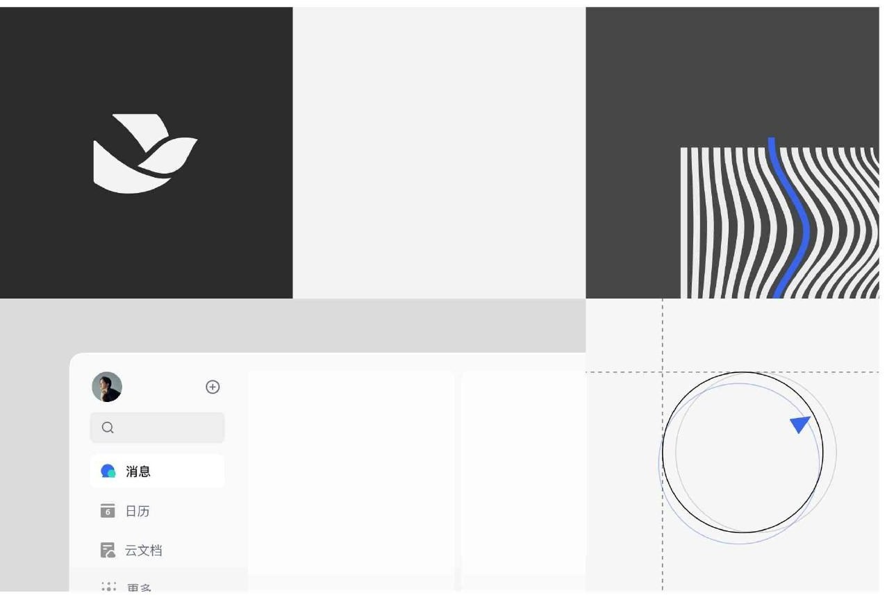
Rethink how we design Lark. Images on this page come from the Lark Design yearbook, compiled by the team in 2024.
What I owned
I set the direction: the brand house, the five design principles, the architecture of the design system, and a two year global design and brand strategy, agreed with product and executive leadership. The team built it: the components, the brand assets, the launches. The yearbook they compiled credits more than sixty case studies to them.
Brand
In spring 2021 we wrote Lark a brand house. One statement: make organizations and individuals more efficient and delightful. One value proposition: an advanced platform for enterprise collaboration and management. One slogan: Feishu, first choice for front-runners. Four tone words: efficient, delightful, leading, future.
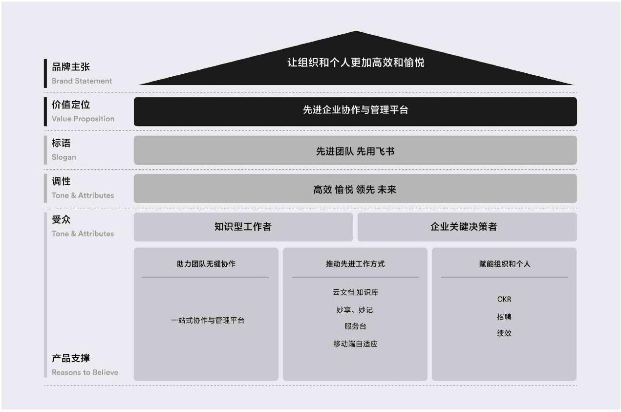
The Lark brand house: statement, value proposition, slogan, tone, audience.
A brand house is a lighthouse, not a route. Between it and an actual mark sat three questions. Could Lark step outside the visual language of its category? Could it look like no one else? Could one identity flex across every place it had to appear, from an app icon to an airport wall?
The decision that settled them was to anchor the visuals to the value proposition first, and to taste second. Visual design is usually judged by feeling, but in commercial design the argument underneath is what holds up. We put one word at the center, advancement, mapped every candidate keyword against it, and aligned that map with senior leadership over several rounds before anyone drew a mark.

Advancement at the center, every keyword mapped against it before any drawing.
The name gave us the form. Feishu means flying letter. A paper plane carried the idea of flight, but not of a message arriving. A carrier pigeon carries both, so the mark became a bird: light, in motion, taking information from one person to the next.
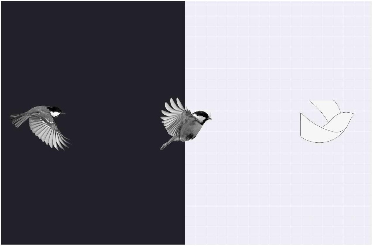
From carrier pigeon to mark.
Around the mark we built a full brand system: a brand blue, a flowing line, a custom typeface for product names, and one color system shared by brand and product. Sub-brands and product symbols were redrawn to match. I then led the team through the launches that took it into the world: offline launch events, pre-sales materials, airport advertising.

The brand design system: mark, color, design language, typeface, applications.

The Lark mark, before and after.

The new mark in the product.
Going international
The brand was written to travel. Lark abroad and Feishu in China shared one statement, one slogan in Chinese and English, one color system, and one design system underneath. Entering a market meant reusing the system, not forking it. The v4 to v5 upgrade marked Lark's takeoff both in China and internationally.
Principles
B2B design has a built-in contradiction. The customer is the company, but the user is a person. The design has to create value for the business and still respect how each person already works.
Information density is where this shows up first. A busy screen tempts you to shrink the type and fit more in, but people cannot read more just because more fits. The real answer is to know which information matters to each role, and build the hierarchy around that.
We wrote this judgment down as five principles: Professional, Creativity, Approachable, Thoughtful, and Quality. They were not a style guide. They were the standard every design review judged against, so that work from 30+ teams still felt like one product.

Two of the five principles: Thoughtful and Quality.

Messenger in light and dark, from my essay on B2B design in the yearbook.
System
The system had three layers. At the top, who it served: Lark's core suite of messaging, calendar, docs, meetings, and email, then Lark's business products, then third-party developers. In the middle, the production work it supported. At the bottom, the shared foundation: tokens, icons, and components built for React, mini programs, Uni-app, Android, iOS, and more, nine tech stacks in all.

Three layers: service targets, business domains, capability supports.
Tokens, design kits, the component library, and the guidelines all sat around one center: documentation. Every part pointed back to it, so a designer and an engineer were always reading the same definition.

Documentation at the center of tokens, kits, components, and guidelines.
None of the 30+ teams had to use it. I started with the teams in the most pain and made the system cheaper than building their own. Once they shipped faster, they made the case to everyone else.
The team
The design team grew from 100 to more than 300 people across 11 teams. I shifted it from junior heavy to 70% senior, and team satisfaction landed 27 points above the company average.
Four years on
In 2024, a year after I left, my team compiled our work into a 259-page yearbook and gave it to me. Reading it again now, it is the peak of a design system built for human readers: principles to interpret, documentation at the center, review by people.
The next system has a second reader, a model. Principles become constraints, documentation becomes schema, review becomes an automated check. That is why I built io.
Next: io, a design system with a second reader →
Get in touch: nickdu.vip@gmail.com · LinkedIn
Images are excerpts from the Lark Design yearbook, compiled by the Lark Design team in 2024.
_ ___ __ ____ __ / | / (_)____/ /__/ __ \__ __ ____ ______/ /_ / |/ / / ___/ //_/ / / / / / // __ `/ ___/ __/ / /| / / /__/ ,< / /_/ / /_/ // /_/ / / / /_ /_/ |_/_/\___/_/|_/_____/\__,_(_)__,_/_/ \__/